You are using an out of date browser. It may not display this or other websites correctly.
You should upgrade or use an alternative browser.
You should upgrade or use an alternative browser.
miniriders.com.au stickers?
- Thread starter salvage
- Start date


Help Support Mini Dirt Bikes & Pit Bikes Forum:
This site may earn a commission from merchant affiliate
links, including eBay, Amazon, and others.
")
SnItChY
Well-Known Member
yup gret concept
needs the .com.au
and also i like the way of life bit
also i cool font i like comic sans but thats me
but i recon something like robs avitor would be good
needs the .com.au
and also i like the way of life bit
also i cool font i like comic sans but thats me
but i recon something like robs avitor would be good
stumbows
Well-Known Member
Well i am at work now but when i get home i surely will make the changes you guys suggested.
Any more suggestions would be great as it gives me an idea of what to try next in themes and so on.
Any more suggestions would be great as it gives me an idea of what to try next in themes and so on.
gravityshot
Member
- Joined
- Sep 9, 2007
- Messages
- 21
- Reaction score
- 0
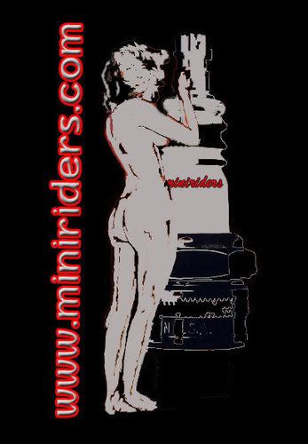
here is my shot at it =]

stumbows
Well-Known Member
What's the name of that font?
unit_mx
Well-Known Member
ok im in the process of doing a full blown graphic kit for miniriders.com.au for my yr12 major currently.Ill keep everyone posted on it.Also will rig up a logo for miniriders all i need is a decent rider silouete (cant spell) so pm me if you have any!!
gravityshot
Member
- Joined
- Sep 9, 2007
- Messages
- 21
- Reaction score
- 0
crazzy #1
Well-Known Member
ohk, it was planned a while ago to make shirts and caps etc etc! two logo's were made (im not sure who done them) but to me they look the goods! i think we should use these for something as they both look good!
stumbows
Well-Known Member
I like the bottom one but the text is just a cut and paste job from the website.
If it were redone it would look alright.
If it were redone it would look alright.
crazzy #1
Well-Known Member
looks fine to me...
stumbows
Well-Known Member
I guess i am just picky having a design back ground but i'd never pitch that to a client in that state.
See how it has forum background within the rectangle that should go and the text should be set against the black.
See how it has forum background within the rectangle that should go and the text should be set against the black.
Wow... I had no idea we had creatives on here.
I guess a few things we need to keep in mind for the logo is making it in line with the current look of the site, to build and maintain familiarity.
So keep the dark colours, dirty look, grungy feel but finish it off with a clean edge. I'm not sure if any of that makes sense.
What do you think of the MiniRiders brand image? What does MiniRiders mean to people and how can we communicate that through the graphics?
unit_mx
Well-Known Member

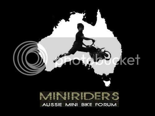
my rough mocked up logo
MITTZ
Well-Known Member
i think that bit at the top of every page in the site that says "MINIRIDERS aussie minibike forum" would make a good sticker!